A Mennonite Wall Clock as Steampunk

An example of steam punk.
Recently I walked into the Gerhard Ens Gallery, the temporary gallery at the Mennonite Heritage Village currently featuring the exhibition "The Art of Mennonite Clocks”, a joint exhibition by the Kroeger Clocks Heritage Foundation and the Mennonite Heritage Village, to check out the latest additions left by visitors at our interactive postcard table in exhibit and read:
‘My favourite clock [in the exhibit] was the “Cadillac Clock” because it looked like it was from steam punk [sic].’
The writing suggests that this particular postcard was left by a younger museum visitor. As you’ve probably guessed, I didn’t have the foggiest idea of what this visitor meant by saying a historical Mennonite wall clock looked like ‘steampunk.’
Fortunately, there’s Google, so I now know that steam punk is:
...science fiction in a historical setting with steam-powered machinery, instead of advanced technology...
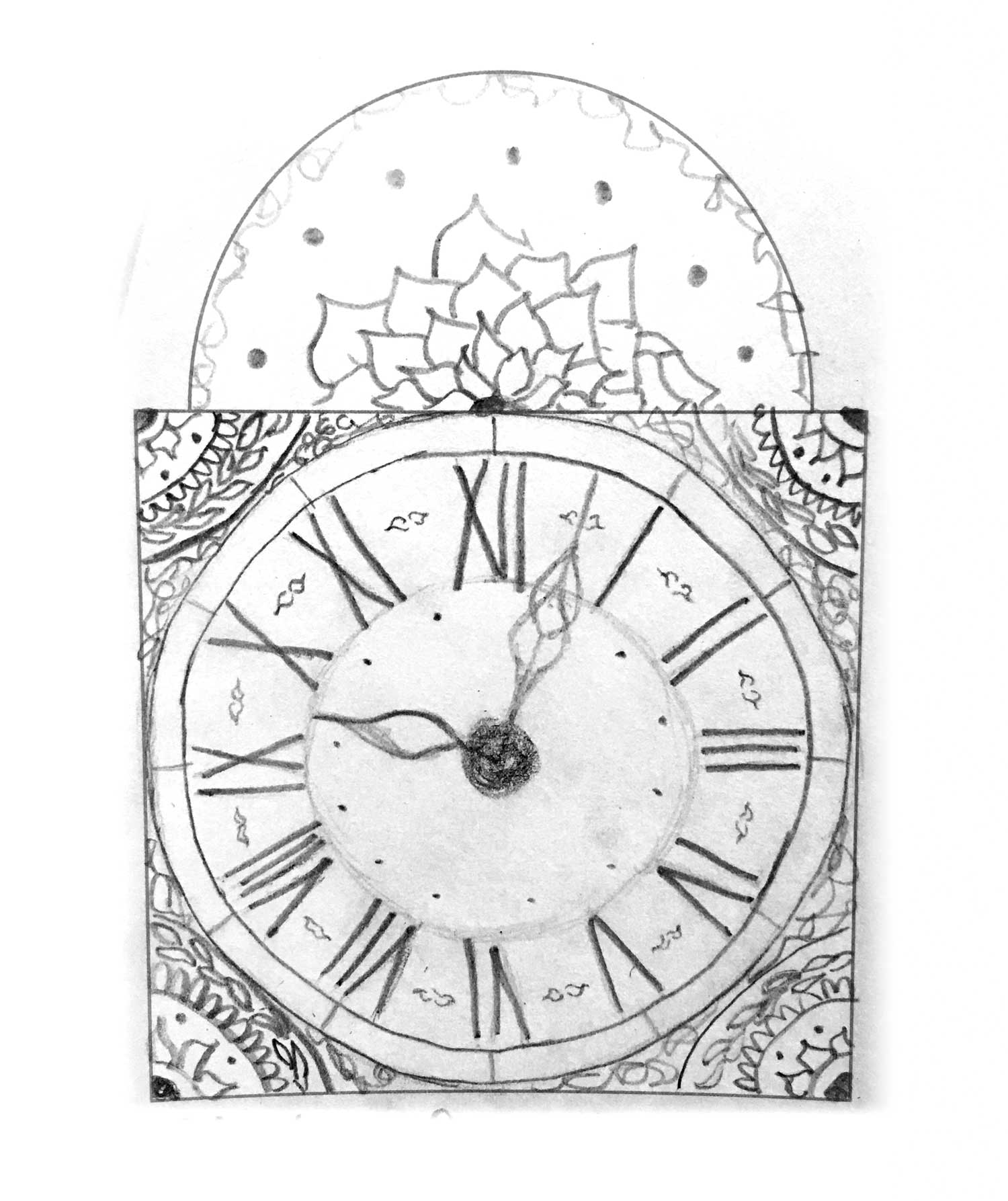
Look at the steam punk photo on the right referred to by our visitor as compared to the interior photos of the “Cadillac Clock” below.

Interior photographs of the ‘Cadillac Clock’ likened to steam punk by a museum visitor.

Once an exhibit opens, it always requires some level of regular maintenance and daily tending: artifacts need to be monitored for tampering or damage, cases need to be cleaned of fingerprints and dust, and items that have gone askew need to be straightened. In the case of The Art of Mennonite Clocks exhibition, this daily tending also involves two tasks that have become a highlight of my museum workdays.
One task is winding the single clock that we have running in the exhibit (though this seems to be a popular job amongst staff and someone often beats me to it.) The other is checking what’s new at the postcard station.
When we plan an exhibit, we always try to find ways to make it relevant to our guests. Why should people care about Mennonite history, and in the case of this exhibit, why should they care to spend time learning about this one specific Mennonite artifact? We try to incorporate concepts that will help answer these questions, include visuals that will grab people’s attention and information that will hold it, and then ask questions that will resonate with our guests, both young and old, and make the connection between history and their own lives. This work is always an experiment, so we eventually just open the exhibit and see how it goes.
The ‘postcard station’ in this year’s exhibit was one of these experiments. We offer two ‘postcards’ for visitor feedback. One asks,
‘What is your favourite clock in the exhibit? Tell us why!’
The other carries the simple invitation:
‘Design your own clock face!’
This station is a delight to maintain because the response has been overwhelming, especially from our younger visitors! We have already had to reorder postcards twice! Because wall space for posting responses is limited, we decided to start an Instagram hashtag so that visitors can also share their creations online. Find MHV on Instagram at @MHVillage and post your creations and reactions to the exhibit with the hashtag #mennoniteclocks.
The postcards demonstrate that visitors are spending time in the exhibit, engaging with the content and learning about these Mennonite wall clocks that have so much to tell us about history. They also show that visitors are engaging with each other, as ‘conversations’ sometimes spring up between postcards that have been posted on the wall weeks apart.
But the biggest takeaway for me as the curator is that children are engaging in a way that we did not anticipate. A glance at the postcard wall quickly demonstrates that our younger visitors are spending a lot of time and creative energy designing their own clock faces after viewing the exhibit.

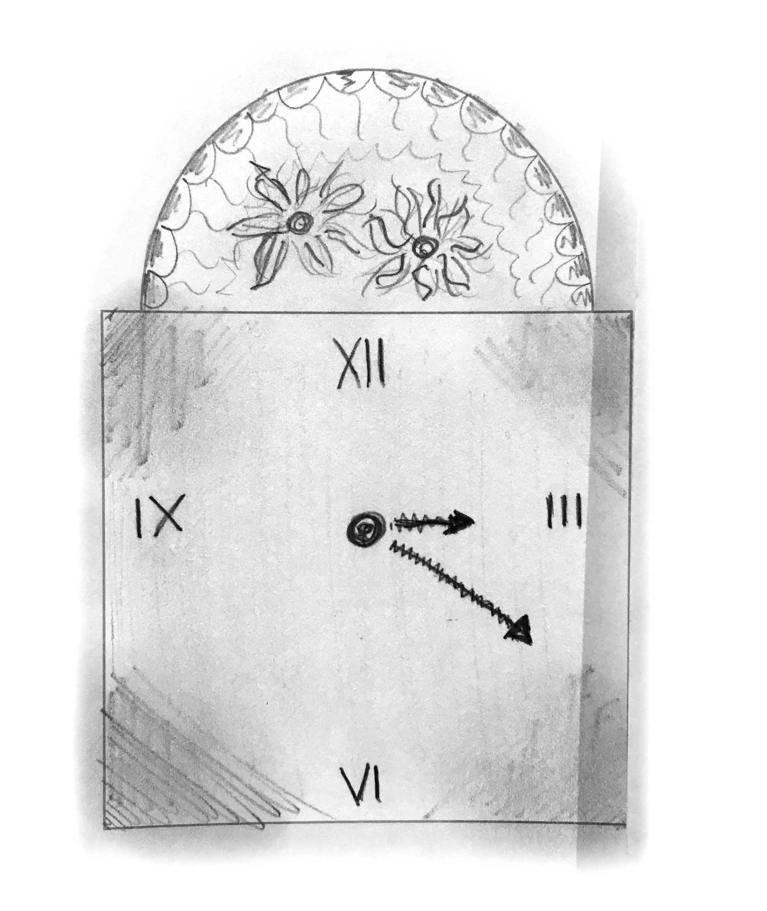
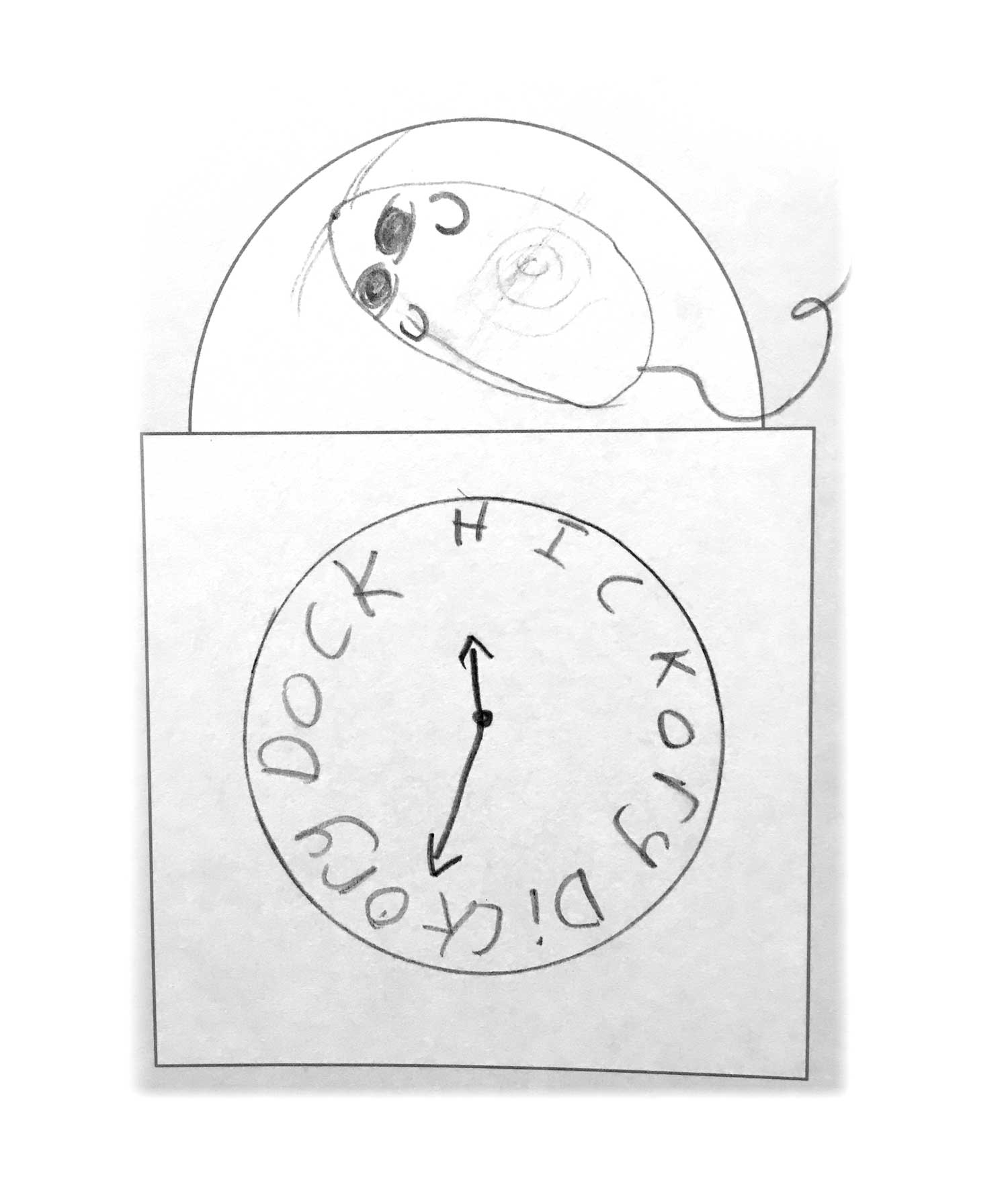
Some of my favourites, including imaginative Mennonite wall clocks based on the ‘Hickory Dickory Dock’ nursery rhyme and on the Harry Potter series, are posted at #mennoniteclocks.
Children that I have observed in the exhibit do not typically engage with it the way adults do. They do not read the exhibit panels and artifact labels in the order the curator would like them to be read. From one point they zip full speed clear across the gallery to something else that catches their eye, and then a moment later exclaim about something else, and run (again, full speed) to the next thing. Two things intrigue me as I watch this take place:
The level of enthusiasm and wonder children can have for the smallest things; and
The seeming impossibility of ever getting a point across to an attention span that is two seconds long.
Although children are engaging with the exhibit differently than adults do, the postcards they leave demonstrate that they are paying attention to these clocks and are captivated by them. A number of younger visitors, for example, have noted their favourite clock was ‘the one with the right time’ or ‘the one that said 2:36 because that was the right time,’ likely indicating their appreciation for the ‘Living Clock,’ the clock that we keep running in the exhibit, which is therefore always on time.

The ‘Cadillac Clock’ (interior photos at the beginning of the article), showing the ‘IIII’ used on 32 of the clocks in the exhibit, vs. the correct ‘IV’ Roman numeral.
Another young visitor left a postcard simply noting: ‘favourite for the fact of the true Roman system.’ Assistant Curator Jenna Klassen and I puzzled over this cryptic comment for a moment and then realised which clock this very astute visitor was referring to. While the dials of thirty-two of the thirty-three clocks in the exhibit inaccurately depict the Roman numeral for the number four as ‘IIII,’ there is a clock in the exhibit that has had its faceplate replaced in a poorly completed restoration that depicts the number as ‘IV,’ in the correct fashion.
After reading this comment, Jenna and I reviewed the postcards designed by children and realised that most of them flouted convention and mimicked the ‘IIII’ found on the majority of the clocks in the exhibit. They may not read all the labels, but our younger visitors had picked up on this minutest of details, which likely slips by most adults. (As an aside, this choice to use ‘IIII’ rather than ‘IV’ on clock dials with Roman numerals was to visually balance the dial to be more aesthetically pleasing. The choice notto do so on the ‘Plastic Kroeger,’ so nicknamed because its poorly restored clock face is covered with a plastic-like veneer, is yet another reason why it is displayed in the section of the exhibit that highlights questionable clock restorations.)